
Career Buddy

Career Buddy connects students and young professionals with career experts for help in choosing a career, writing resumes, interviewing for jobs, and getting promotions.
The Problem:
Role:
Figma
Google Meet
Typeform
OptimalSort
Usability Hub
Connect young professionals and students with experts who could help them choose a career, get promotions, write better resumés, and interview successfully.
Many young professionals are unhappy in their current career or job, and feel lost in choosing a career.
UX/UI Designer and Researcher
Scope:
Tools Used:
6 months
The Goal:
Strengths:
Weaknesses:
Threats:
Opportunities:
Competitive Analysis
To understand the competition, I completed a SWOT analysis and discovered that young professionals and students were underserved in the career advice and development space.
A similar service but with a native application for Android and iOS
A similar service but geared toward general career development (life coaching, interviewing skills) instead of tech skills

BetterUp
Personalized coaching with quality coaches
Lack of options to connect with experts on interviewing skills or resumé building
User must complete long onboarding process
Some bugs which make for difficult login.
Coaches leaving for better opportunities with better pay.
An app that allows users to find coaches without having to create an account
An app that allows users to find quality coaches to help with interviewing, or resumé-writing in additional to other career advice.

Mentor Cruise
Mentors in a variety of tech subjects
Clean, aesthetically-pleasing site
7-day free trial
Monthly subscription rate is not clear.
No native applications for Android or iOS
Bootcamps and courses, like those found on CareerFoundry or General Assembly
User Stories
I used user stories to get into the mind of my user and determine specific tasks they would be doing while using the application.
Tour app, to understand how to use it.
Create and log into an account to save personal details
Browse career experts
Write and send messages
Connect Venmo and Paypal for convenience
Choose call time from a calendar
Video call experts”
“As a user, I want to…
Generative Research
I wanted to answer some questions I had on a large scale. These questions didn’t require the nuanced feedback that would require an interview, so I created and released a survey.
I wanted to know what kind of career help users wanted.
Research Goals:
Understand the user’s goals
Identify features users have found helpful in similar services/products
Identify features users have found frustrating in similar services/products
Identify challenges and frustrations users have in seeking career help
70% of users said they would consider seeking help for crafting/critiquing a resume and getting better at interviewing. Fewer than 30% said they would seek help when choosing a career
Those who reported using websites used job board sites.

Survey Findings:
User Interviews
Ruth
Age: 25
Profession: nurse
Education: BA
Home: Oklahoma City, OK
Sarah
Age: 27
Profession: nurse
Education: BA
Home: Oklahoma City, OK
Jeremy
Age: 26
Profession: CRNA student
Education: MSN in progress
Home: Oklahoma City, OK
Research Findings
There was particular interest in learning resumé writing as related to a specific field.
Participants were interested in knowing all careers available to them, and what a day in the life would be like.
Many were frustrated in the job hunt process: not finding relevant information about a company, or getting their application thrown out by an algorithm before anyone looked at it.
Participants found balancing sounding impressive and authentic as challenging during an interview.
Participants found Linkedin helpful for keeping and showcasing experience/skills (a kind of online resume that is easy to update).

User Personas
I created a couple of user personas based on my target demographic so that I could better get in the mind of the user and understand their motivations, goals, and needs.

Edgar:
Goals and Needs:
Discover new career possibilities he hasn’t thought of.
Know what a day in the life of a prospective career would be like.
Know all the pros and cons of prospective careers
Goals and Needs:
Discover different job options within education.
Understand what it would take to get a master’s in education.
Be able to interview with confidence
Write a resume that highlights her myriad of teaching-related experience
Sophie:

I asked myself what scenarios users would be in and what goals they would have and mapped out their emotional states as they navigated the app.
User Journey Maps


User Flows
I designed common user flows as a way for me to step back and think of the app holistically before I started designing individual screens.


Site Maps
In designing the overall layout, I originally thought there would be a home page and from there, the user could navigate to more specific pages. But I didn’t consider what the user would experience on the home page.

Card Sorting
Original Site Map:
I used a card sort to get users’ input on the information architecture and navigation of the site. What pages belonged in which places and would be intuitive for users?


Updated Site Map:
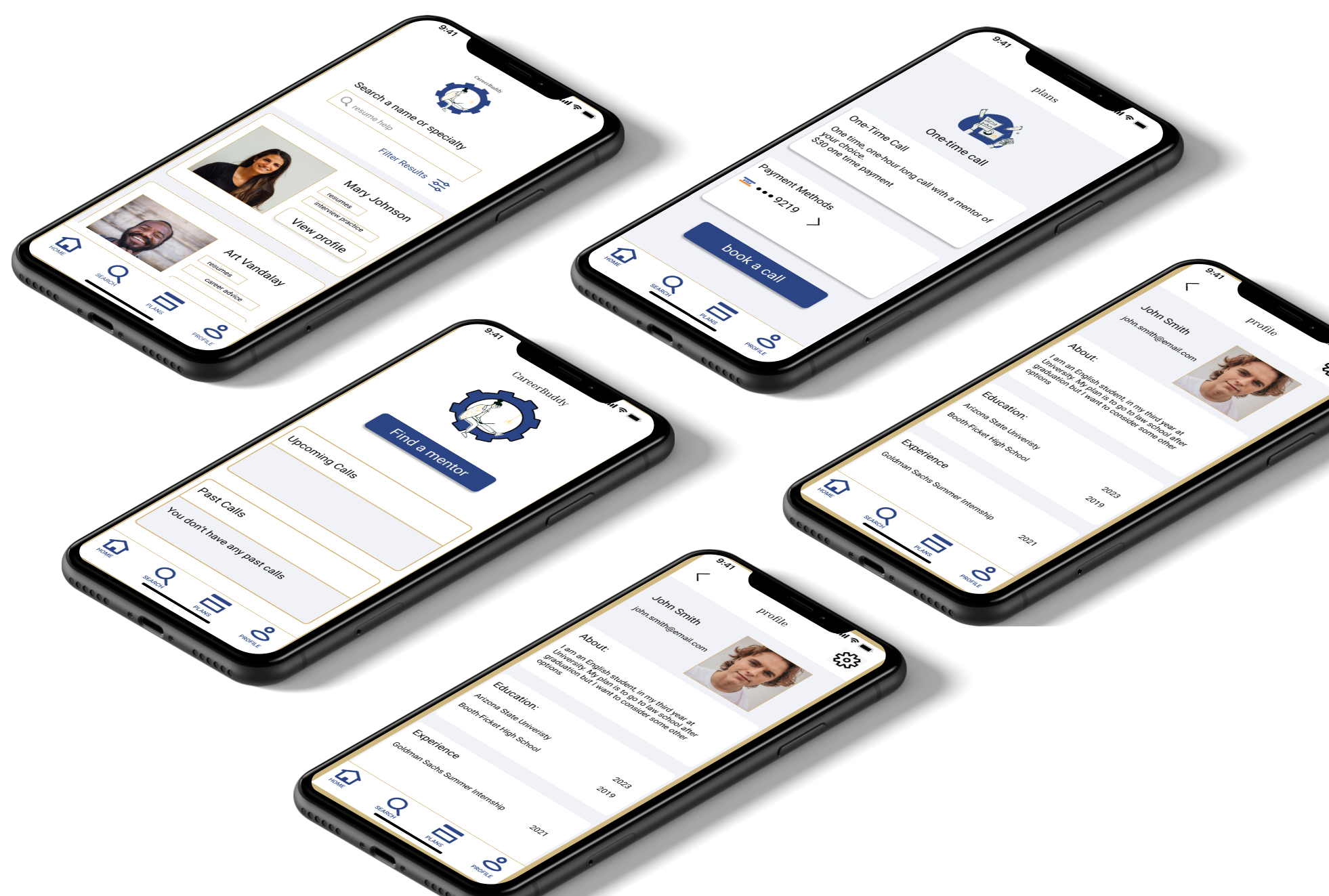
Wireframing
I started drawing rough sketches on paper. This proved frustrating and educational as I couldn’t simply press control Z to reverse a line I had drawn. I had to put more thought into my sketches.


I then used Balsamiq to flesh out these rough sketches before playing around with Adobe XD and Figma. I ultimately decided to use Figma because I found it easier, and it seemed more popular amongst designers, as it allows for real-time collaboration.
One thing I wished I had known at this stage was to label and catalog every component and frame as this would have saved me a tremendous amount of time down the line.

Usability Tests
I conducted my usability tests remotely and moderated them. I wanted to observe users’ expressions and hear their thought processes as they interacted with the prototype. I also wanted to widen my pool of participants by testing remotely.
Test Goals:
To measure learnability and efficiency in this test for first-time users interacting with this application.
To measure the success rate users correctly complete basic initial tasks such as logging in, as well as the time on those tasks.
To measure learnability and efficiency in this test for first-time users interacting with this application.
To look at the success rate of users to correctly complete basic initial tasks such as logging in, as well as the time taken on those tasks.
To determine if participants understand the service the app provides.
To determine how learnable and efficient the navigation of the site is, and whether participants can find what they are looking for with ease.
To measure the effectiveness of the layout by looking at the learnability of the app and the error-making of participants on a scale of 0-5.

The home page should be a dashboard with mentors under the search page.
“Calls” and “Search” need to be better differentiated.
Users need to be able to go backward through onboarding.There needs to be an initial landing page before onboarding.
“Skip” should be changed to the clearer “go to home.”
Have a trial option as one of the filters on the search screen.The “search” placeholder text should be more specific.
Not enough of the search page scrolls upward on the search screen.
Test Objectives:
Applying Gestalt Principles
With changes made from the usability test results, I began delving into more detailed UI work.
I used navy as the main color for the project, as it connoted professionalism, and I used gold as a warm highlight color.

Principle of Emphasis
I differentiated this from the other login options to make it clearer that this was the default option.

Principle of Proximity
I grouped these options in a box to differentiate them from “New account” and suggest they all share the same feature of logging in with a third party.
Principle of Balance
I used asymmetrical balance between the top half and bottom half of the screen to avoid a cluttered feel.
Principle of Emphasis
I emphasized the call-to-action button with a different color and by centering it.
Principle of Similarity
Call-to-action buttons all share the color, shape and rounded corners.
Principle of Similarity/ Proximity
All upcoming calls look similar. Past calls look similar to upcoming calls but in the “Past Calls” card.
Accessibility & Designer Feedback
I let fellow designers give me some feedback and began thinking about issues of accessilbity.


Having not yet learned of auto layout, I had to go back and correct the alignment of all text.
People seemed confused by what the details of the profile pages would be, so I got more specific, and in doing so, realized some flaws in my design.
I created cards to help categorize and clean up the profiles.

Enlarged boxes for easier visibility
Made fonts larger
Changed the search text to a higher-contrast font and added a placeholder text within the search box.
To make more room, I made the filters collapsable.
Retrospective
Challenges:
I had difficulty finding relevant competitors during the competitive research stage.
None of my interview participants had used any app or website similar to mine, so getting relevant feedback proved challenging.
I got caught up working on a few user flows and neglected some important components, like having a way to call the expert after a booking was made.
I had some difficulty with organization, having not yet learned about auto layout features on Figma.
Accomplishments:
Solutions:
Next time, I will invest more time to find participants for my survey and interviews. I will look on social media sites, especially LinkedIn, as my app is related to career services.
I think I could have caught more errors in my design if I was working in a team, especially if I regularly had to explain my design decisions in weekly stand-ups.
Lastly, I would have spent more time labeling and cataloging components in Figma to save myself time during future iterations.
Next Steps:
I think I managed to create a simple design that avoided the cognitive overload for the user. It is intuitive and has a clean, simple aesthetic.
The current version of CareerBuddy is tailored to the user, but I must add features for the career mentors to create an account, log in, apply for a position as a mentor, and of course interact with the user.
This project was completed as part of Career Foundry’s UX Immersion Course and I want to thank the wonderful tutors and mentors who helped me every step of the way.
Illustrations
I imported illustrations I found on Figma’s community feature. Surface by Treetop created these as a free resource so I want to thank them for the use of these illustrations.

