

The Problem:
Infinite Campus Gradebook Redesign
Infinite Campus is an education platform used by parents and teachers to communicate grades, assignments, roster information and attendance.
This is a personal project and I am not affiliated with Infinite Campus. I do not own any of the original designs by Infinite Campus.
As a teacher, I saw that many teachers struggled to learn and use features of the Infinite Campus website, and school admin spent valuable time teaching teachers and answering questions.
Tools Used:
Google forms
Figma
Google Meet
Slack
The Goal:
Redesign the grade book feature of Infinite Campus so that it was intuitive and learnable for both new and experienced teachers.
My Role:
Design Lead
UX Researcher
UX/UI Designer
Scope:
2 months

Survey Objectives:
Using Infinite Campus as a teacher for 2 years, I experienced first-hand the best and worst of its design. I discovered issues that I and other teachers had with the site, but I wanted to ensure I was designing, not on assumptions, but on data; not for myself, but for all teachers.
Understand features that teachers wanted
Understand teachers’ pain-points.
“As a teacher, I want an option to carry categories and assignments over from one school year to another, so that I can save time on the backend.”
Create assignments
Post grades
User Research
Survey Findings:
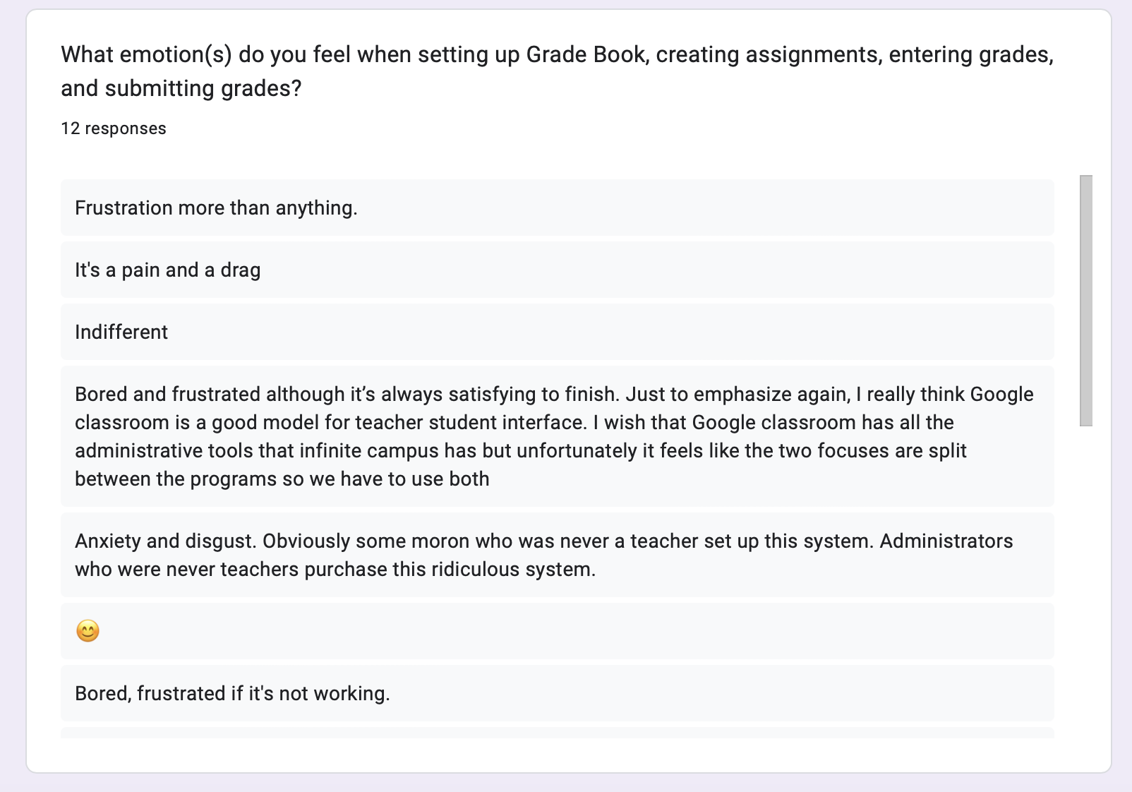
Teachers found setting up Gradebook to be long and tedious.
Teachers found it overwhelming to scroll through all of their students’ assignments for the entire year.
Understanding how to post grades and the purpose of different aspects of the posting grades feature was confusing for many teachers.
Teachers were unsure whether or not their grades were posted.
User Stories
I used the insight from my survey to create user stories and then user flows to better understand more specifically what I would be redesigning.
“As a teacher, I want a confirmation prompt so that I know I am submitting my grades.”
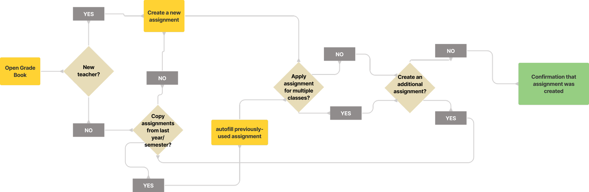
User Flows
I took the user stories I wrote to create some user flows, to understand the starting point for my designs.
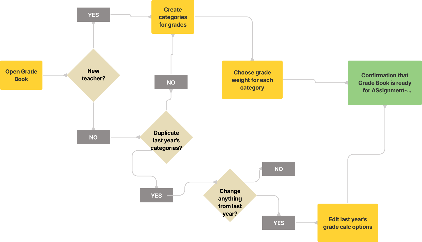
“As a teacher, I want an easy way to create one assignment for multiple classes, so that I don’t have to rewrite it each time.”
Set up Gradbook
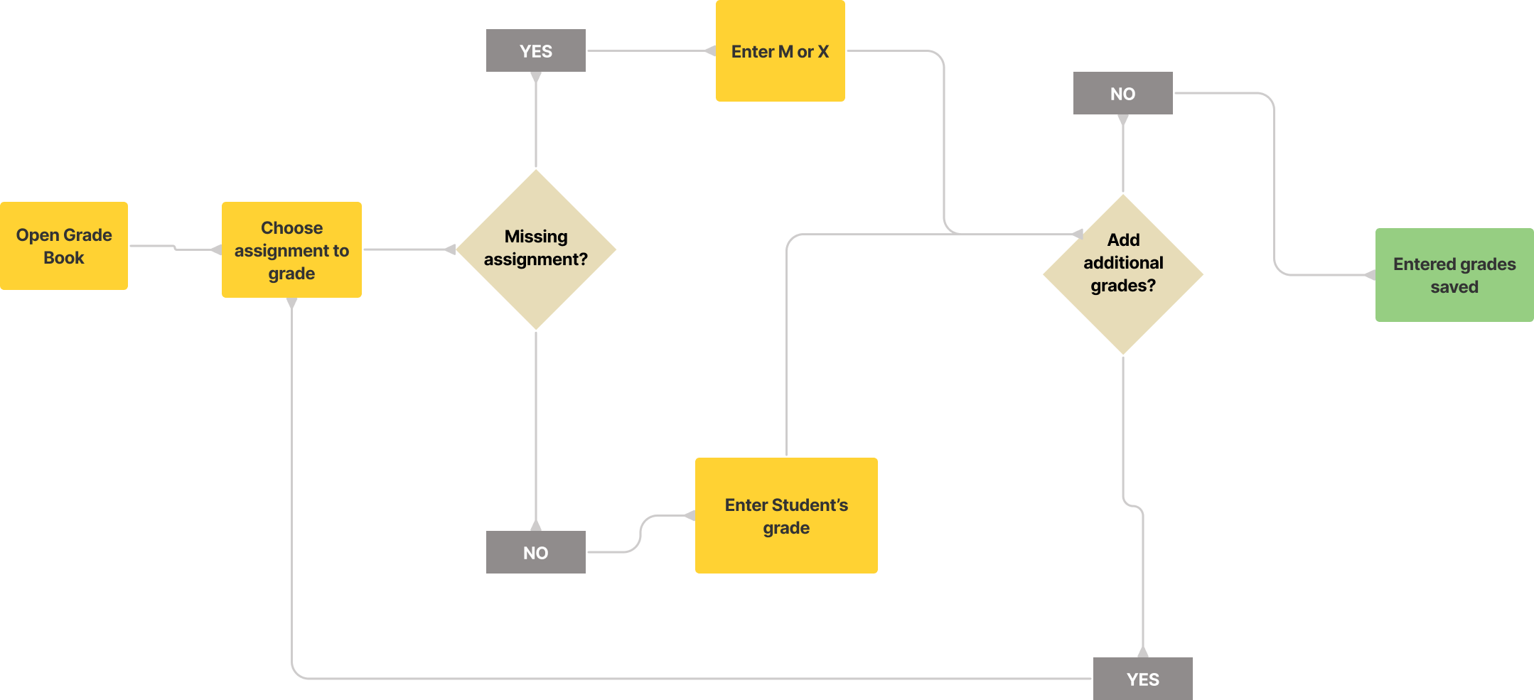
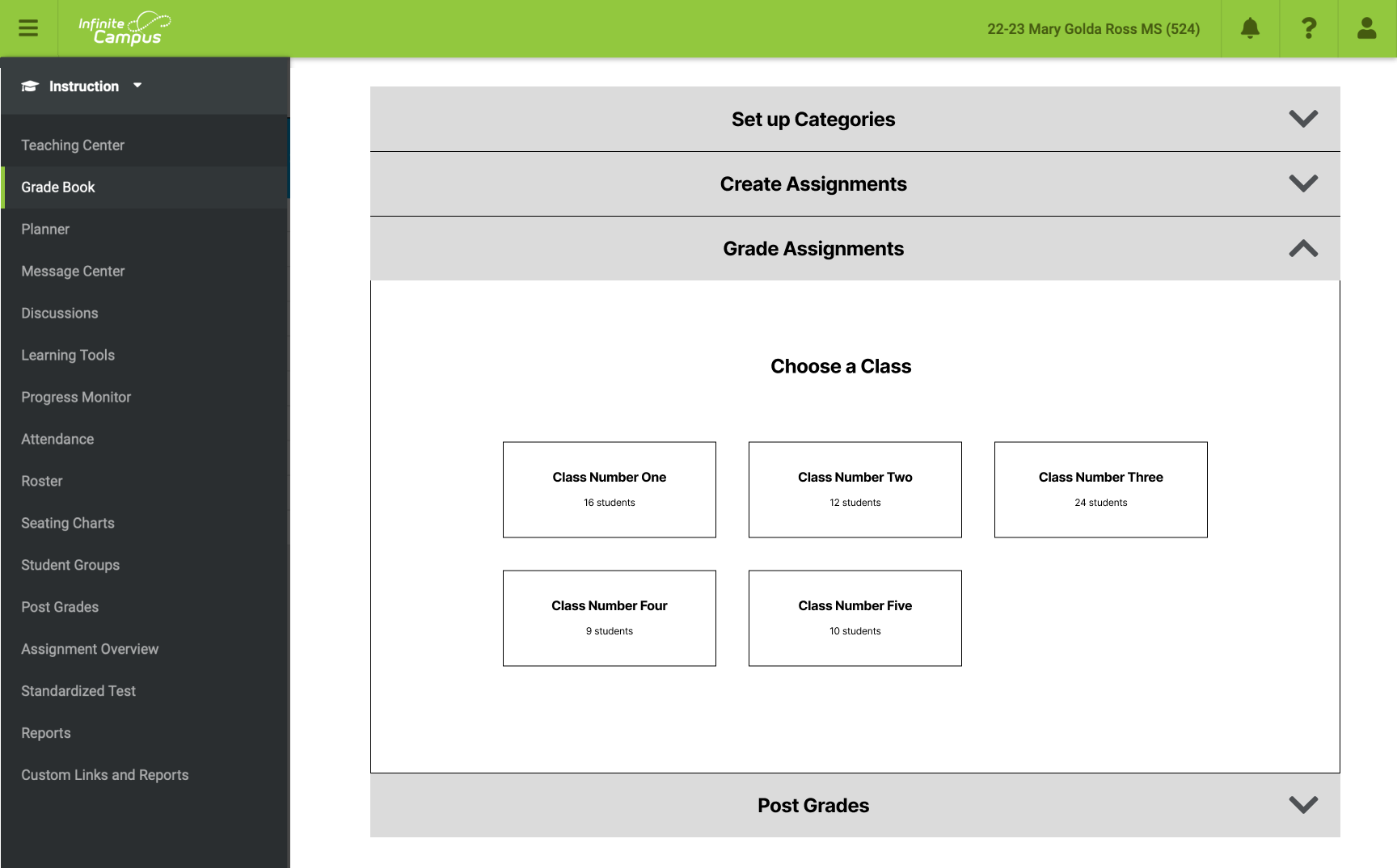
Grade assignments
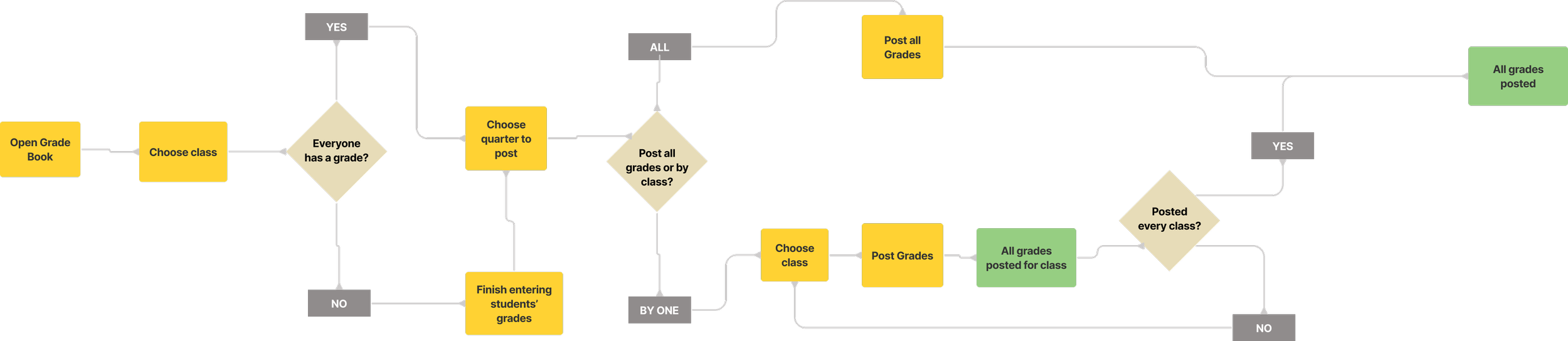
My user flows led me to think of four basic steps for the Gradebook features:
Setting up the Gradebook
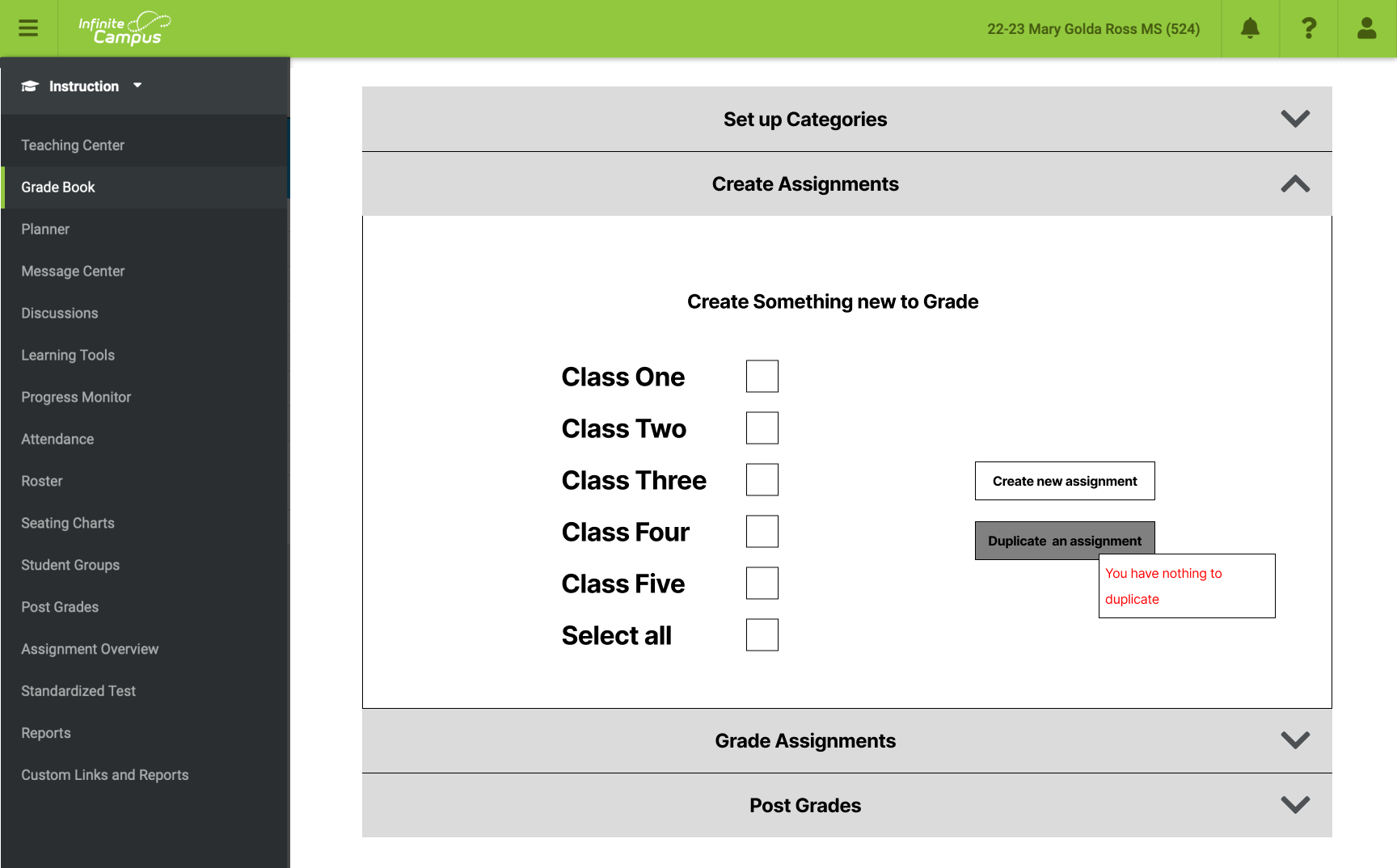
Creating assignments
Grading assignments
Posting grades
Ideation
This led me to my first design concept. I wanted to break down these steps into intuitive, bite-sized pieces. If people found Infinite Campus confusing, I wanted to make it idiot-proof.

As I moved from lower-fidelity to higher-fidelity wireframes, I was able to notice flaws in my design and see that I could use a lot more space than I had.

User Testing
One of my favorite things to do for a project like this is a usability test, as it helps me understand objectively the issues with my design and how I can improve usability.
I conducted three usability tests with people from around the world.

As predicted, I discovered usability issues, but I also came to question my entire design and appreciate the decisions the original designers had to face.
On one hand, I wanted to lay out the process of creating and grading assignments in clear, easy-to-follow steps with no cognitive overload.
On the other hand, I wanted quick shortcuts for more competent users, so they wouldn’t be clicking through ten steps in order to accomplish anything.
I reached out to my network of designers to seek advice.
Revised Designs


I wanted to make the process easy and intuitive, but also convenient for users who had grown familiar with Infinite Campus.
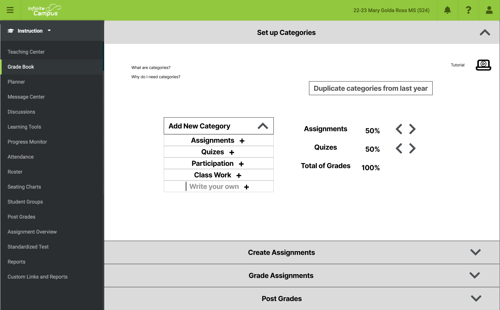
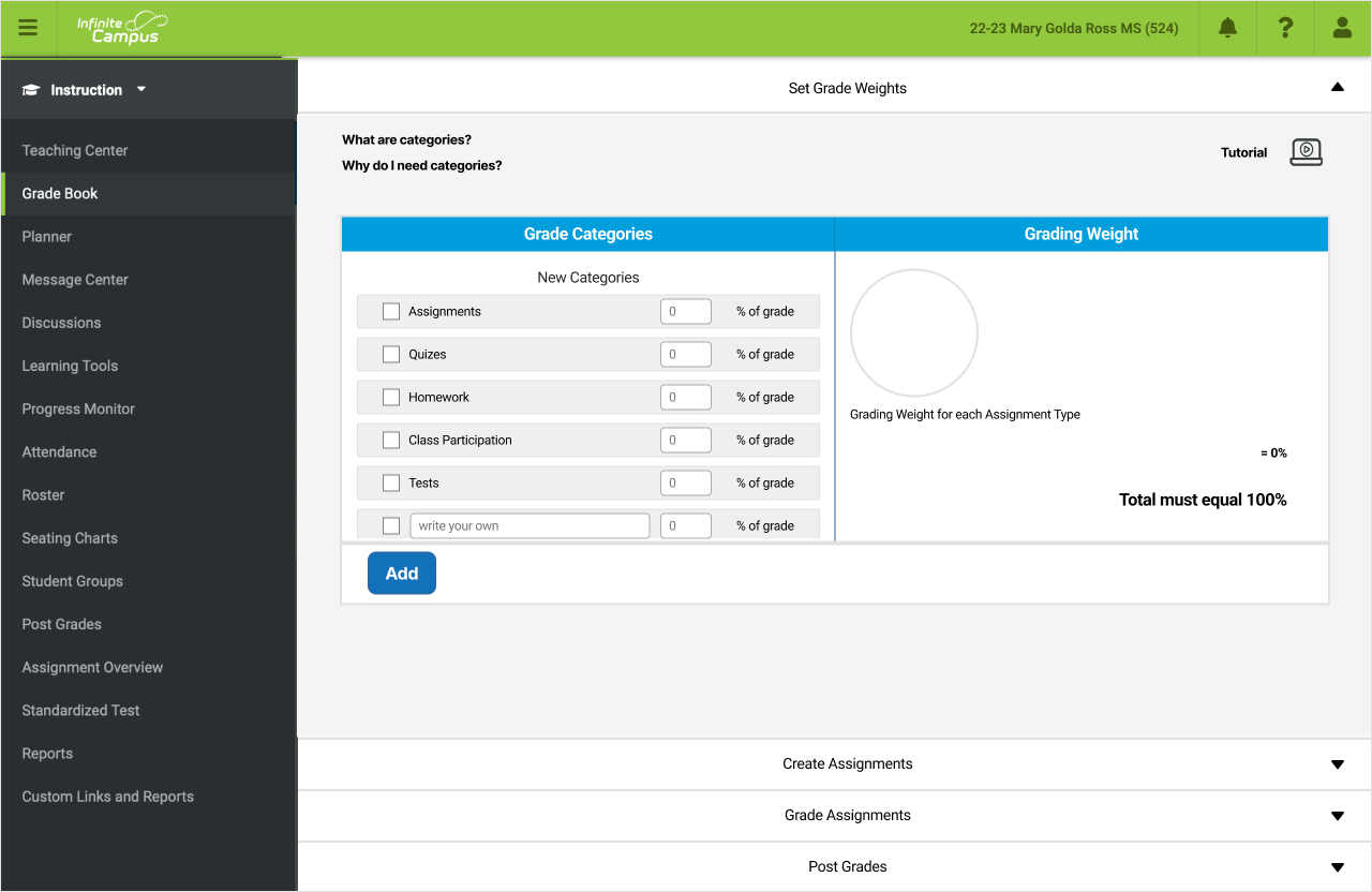
I think I accomplished this by creating a method for setting up grade weights that helps users easily grasp their purpose and function.
I think The assignments page is also intuitive, but because everything is on one page, is also quick to navigate and find anything needed.
Original:
Design Impact
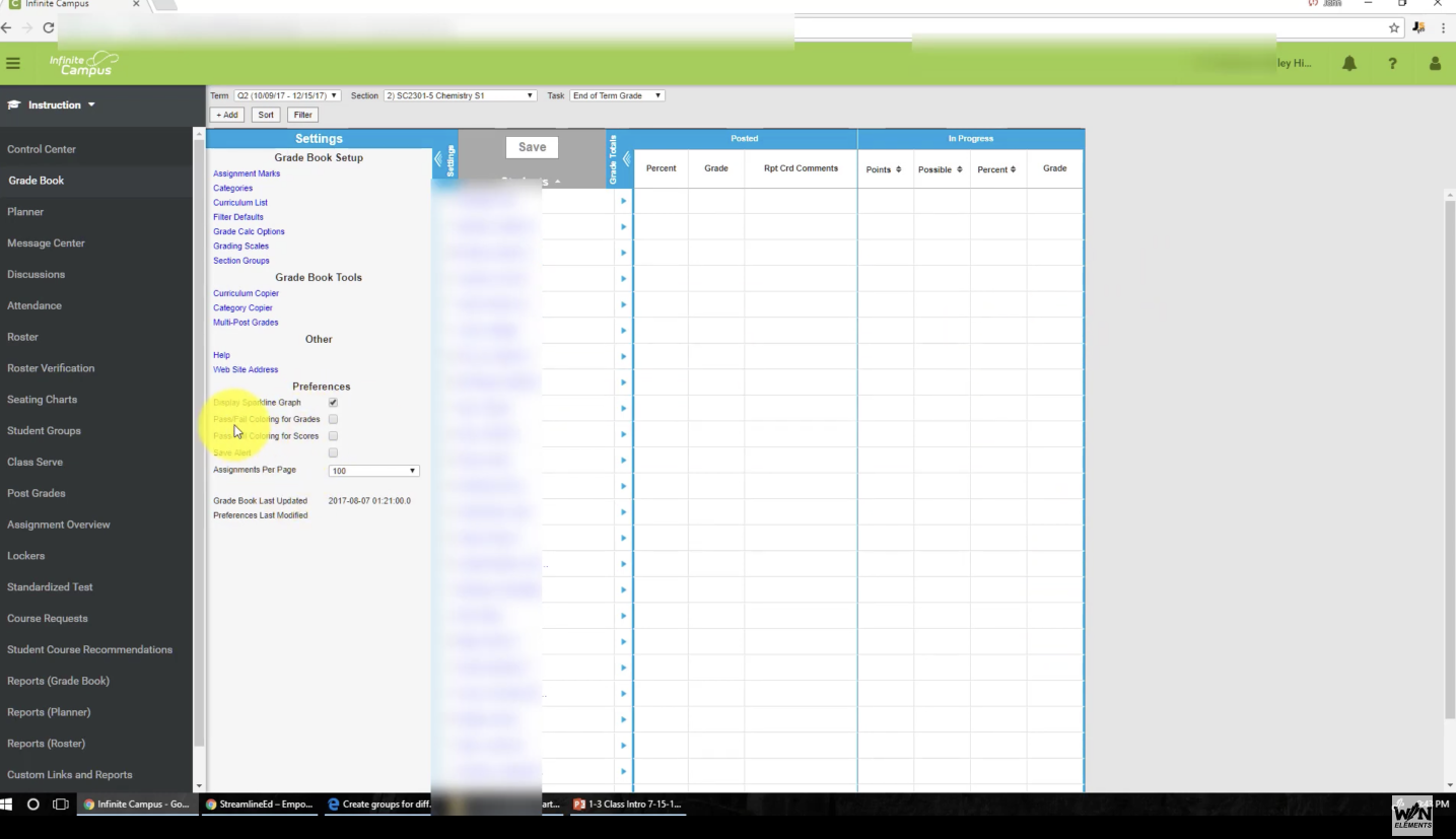
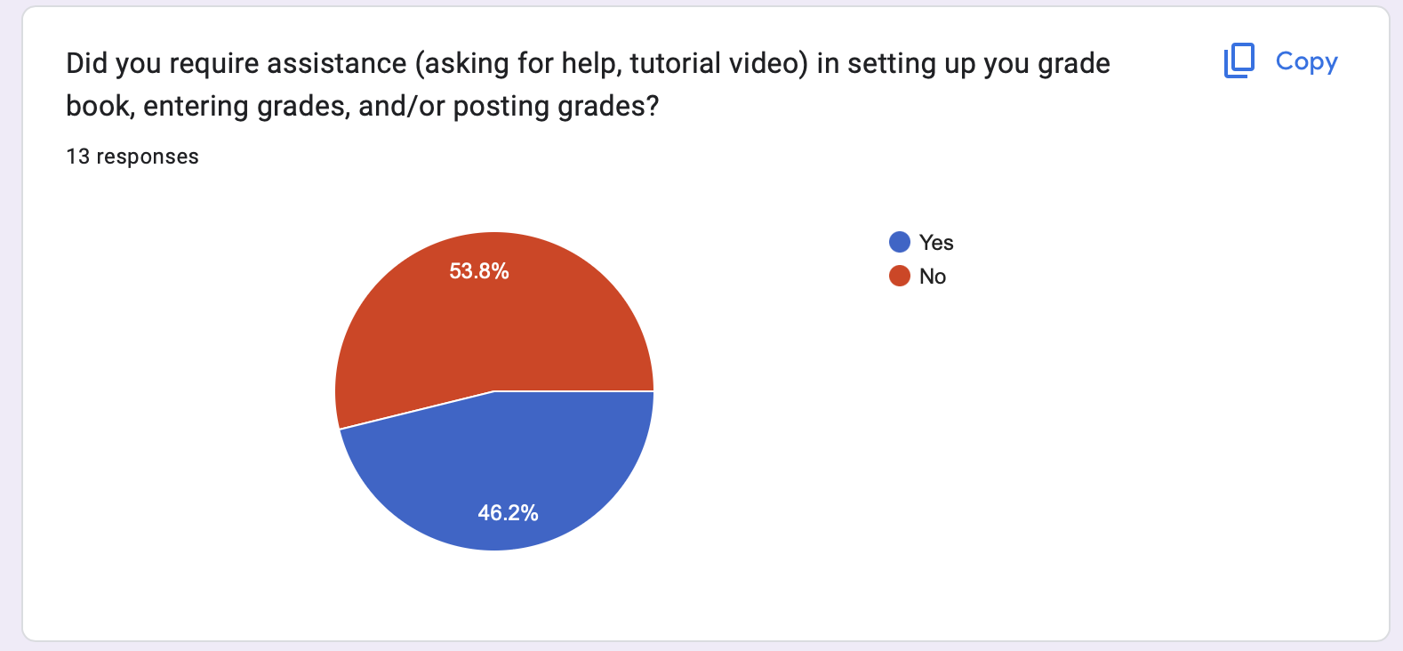
Teachers found Grade Calc Options to be confusing and 53% of the users surveyed reported that they needed help to set it up.
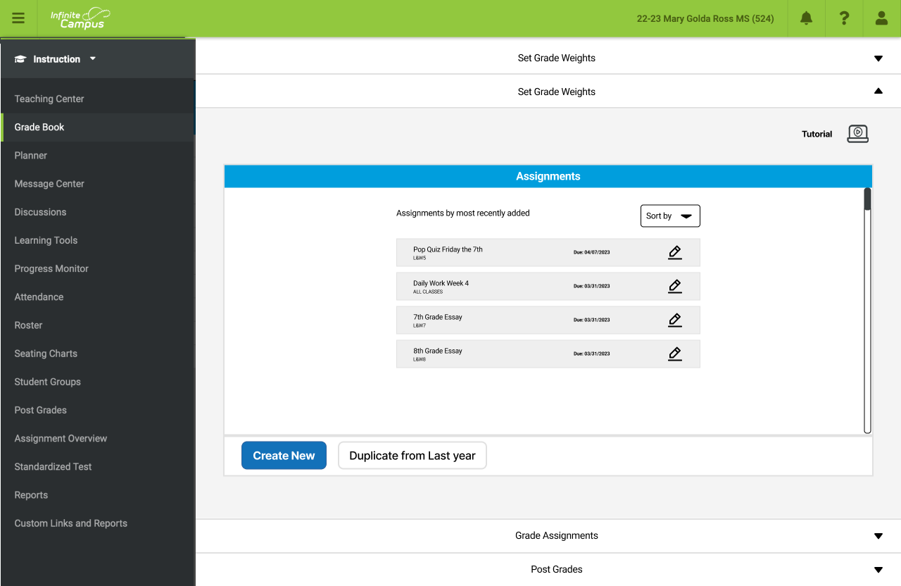
This page on Infinite Campus does a lot of things right. It is easy to tell that I am looking at my class and all assignments for those students. It is quick to then click on that assignment to enter grades
But after months of school, there are too many assignments to easily track, especially given the abbreviation system.
There were also minor issues, like lack of confirmation messages letting the user know grades were submitted or saved.
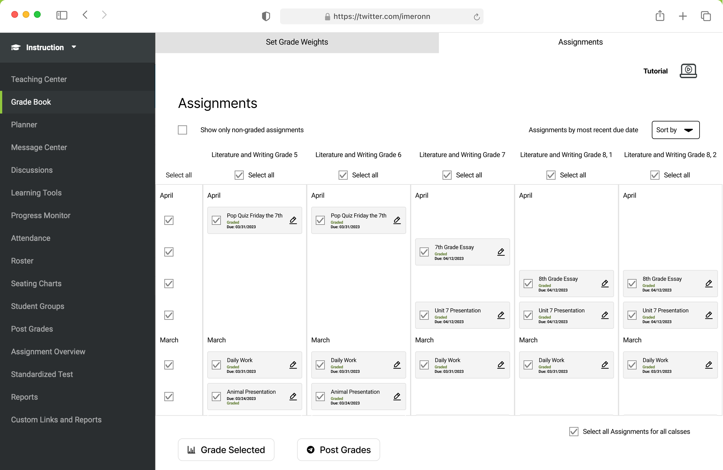
My design:
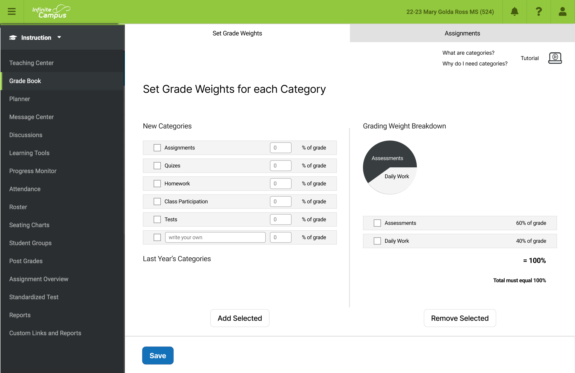
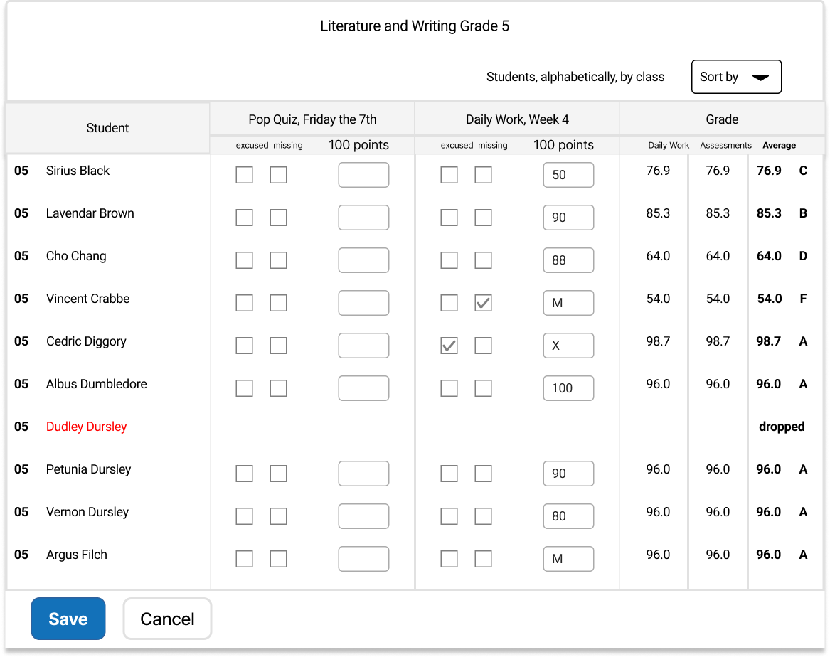
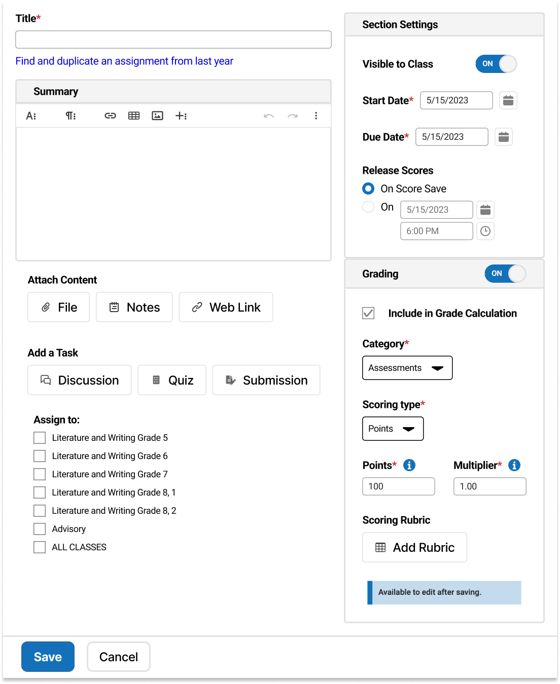
There is now a clear way to add categories and grade weights for each of those categories. I added percentages and sample categories to help users understand what the weights are for. I also added an optional tutorial so teachers get immediate support

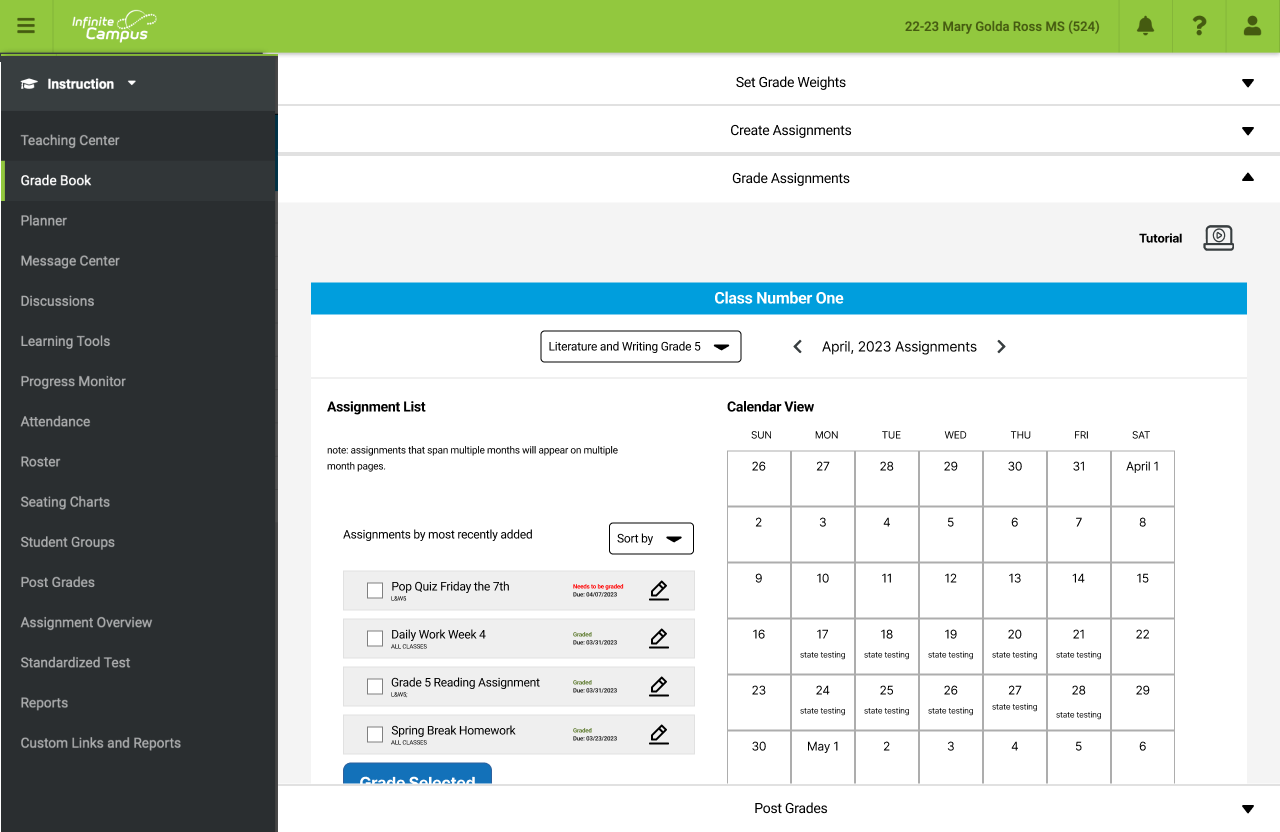
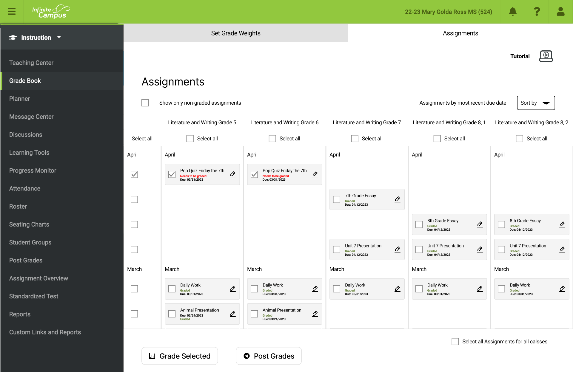
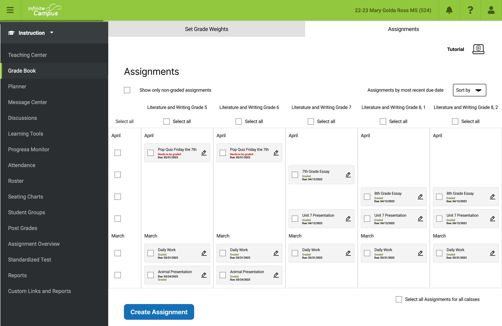
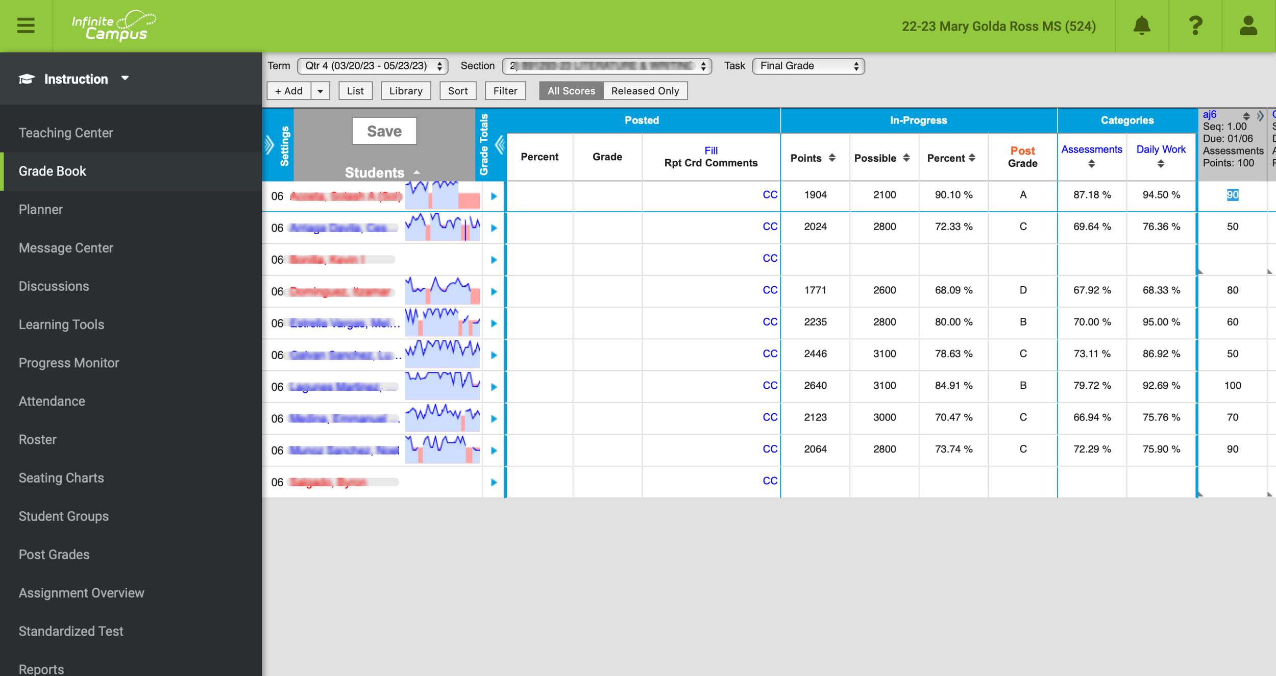
The Grade book here is a higher-level view of classes and assignments. Teachers can see every assignment for every class, including which assignments are for which class. They can see that “Pop Quiz” applies to both the Grade 5 class and the Grade 6 class.
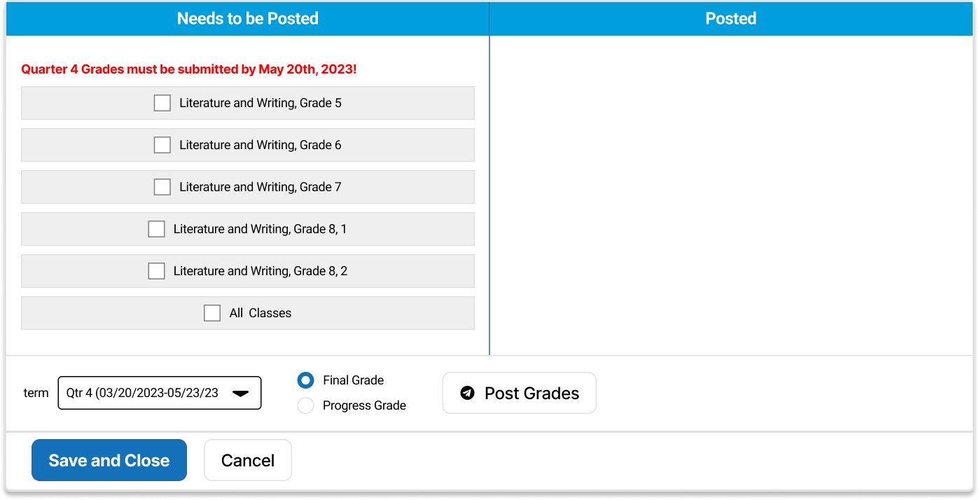
Teachers can view and grade one assignment for one class, or multiple assignments for one class, or one assignment for multiple classes. Teachers can also select “all” when wanting to post grades, to expedite the process.

Challenge:
This was my first redesign, so I had to balance following the Infinite Campus style guides (without knowing them) and changing what I saw as issues with the design.
I released a survey and after I did, I realized that I had not created a great survey. I got a lot of useful feedback, but I was also drowned with a lot of suggestions based on assumptions of what participants wanted. For example, participants wanted a tutorial. But if Infinite Campus were more intuitive, they wouldn’t need a tutorial at all.
Challenge:
Retrospective
Solution:
I inspected parts of the Infinite Campus site to create a style guide I could follow. Where there was no clear indication of a rule to follow, I allowed myself to design the best thing I knew how.
Challenge:
I categorized my research findings into “problems” users faced and “solutions” they suggested. I focused on the problems and came up with my own potential solutions.
Thanks to…
Tommy Yi, for his insightful design feedback, to my colleagues and all other teachers who serve their community and who gave me invaluable data with which to work, and to the following photographers for use of their images:
Donald Teel
Jonathan Cosens Photography
Chalo Garcia